Wine and Design
In Austria, wine is a part of daily life. Where Heurigen and Buschenschanken (Wine taverns) are more than just gastronomic establishments, where Gemütlichkeit (Comfort) is a lived value – we at Neuherz & Partner have discovered a new love and specialist area: design for wine – because the digital age demands its very own answers for a very traditional cultural asset.
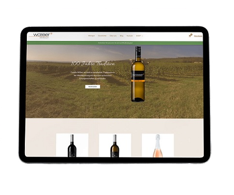
Wine belongs to Austria and vice versa. Winegrowing is a significant economic driver and feel-good industry in this country. What do we have to do with it? We at Neuherz & Partner have learned to love winegrowing as an industry – because it suits our country and because corporate design, graphic design and the design of wine labels and contemporary web presences are essential for many agricultural businesses. And because, despite the international orientation of our agency, we also like to apply our creativity and technical know-how to help local businesses.
What we like about creative work around wine and its marketing is the variety: so many approaches and styles are possible for wine design!
Wine is the product of a whole year’s work. Wine labels have quite a significant impact on wine drinker’s purchasing decisions. So we say: The wine and the corporate identity of its producers are worth every bit of attention and care.
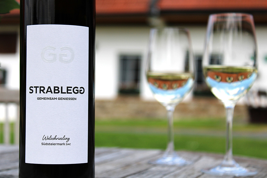
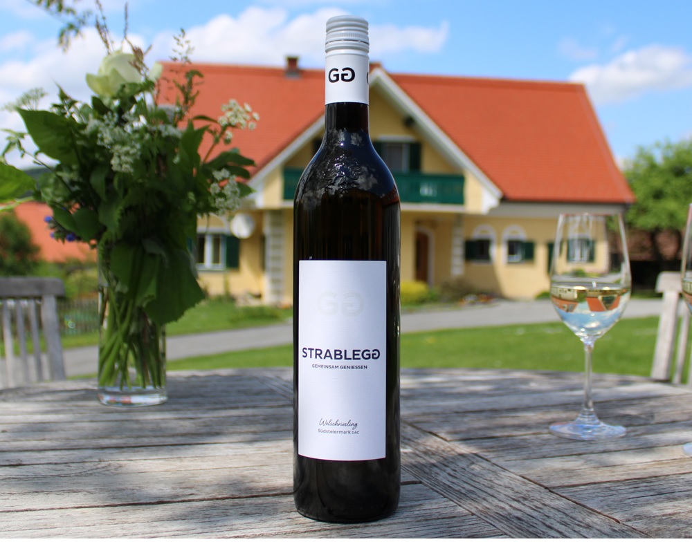
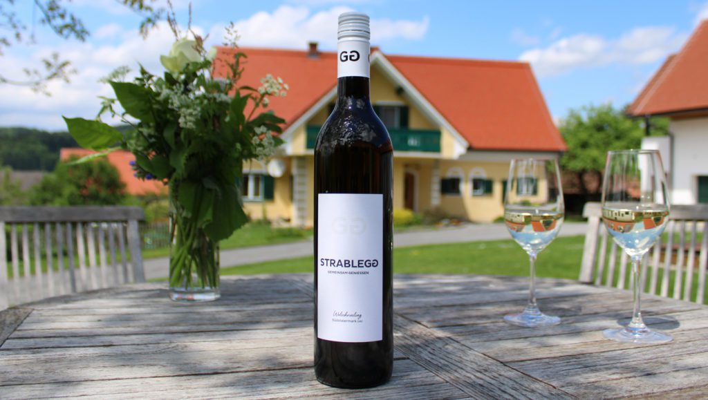
Strablegg – Wine with a new look
We had the opportunity to get to know the family and the winery intensively, in order to create everything from the logo to the entire corporate design – from the wine labels for the bottles to the new web presence to ensure everything shines with a contemporary, unique and modern look. If you follow the link you’ll see our work but you’ll also learn more about an opportunity to shop and vacation with a warm, hospitable family business.
We chose a high-quality, rough, grooved paper for the wine labels. The central element has embossing and a gloss varnish and two mirrored Gs, which echo the new claim “Gemeinsam genießen” (Enjoy together) which is also found in the winery’s logo lettering.
Working in unison with our client we decided on a minimalist design. What do you think?
Do you know or run a winery whose design is ripe for a relaunch? We are looking forward to hearing from you!
Working in unison with our client we decided on a minimalist design. What do you think?
Wine and design – why they are best enjoyed together
Our recommendation for wineries? A well thought-out communications strategy that clearly sets our customers apart from competitors and makes their brand unmistakable. A design that creates real added value – and makes a real difference. As specialists in packaging with many years of experience, we provide wine bottles with labels that attract attention. Our digital agency creates many contemporary corporate identities but there is no such thing as an out-of-the-box label.Do you know or run a winery whose design is ripe for a relaunch? We are looking forward to hearing from you!